As L&D professionals, we’re always looking to make our sessions as effective as possible, whether they’re face-to-face, eLearning, virtual classrooms, or any other method.
Different techniques abound – I’m sure you have your own preferences that work well for you. However, have you ever thought of using colours to ‘classify’ your learners and so appeal to their favoured communication styles?
Having tried many systems – there are literally hundreds available – I always come back to a really straightforward model that’s quick, simple, and easy to remember whilst still being surprisingly accurate:

Before we go any further, can I just say ‘Yes, I agree, it’s impossible to pigeon-hole people into four categories’?
This basic system allows you to think around different options when presenting your learning and flex your style to appeal to the different preferences – just remember few people are just one colour, most span at least two and often all four to varying extents. And if you find the colour combinations jarring, feel free to change them to suit your colour palette.
If you’re thinking ‘learning styles re-hashed’ just pause a second!
Regardless of your feelings about such groupings and whether or not they ‘hold water’ in your opinion, having a structure to work with can, in my experience, be really helpful. For example, I still find thinking about appealing to as many human senses as possible, regardless of their ‘learning style classification’, produces a more balanced and successful approach. The same applies to communication preferences – if not more so as if we don’t communicate well, we’ve got real problems…
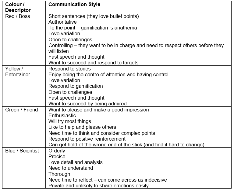
Talking of preferences, here is a very brief summary of some of each colour’s key communication inclinations. As you read through try and think if you can identify people you know in each of the colour categories:

Thinking about those you know, you can probably fill in a lot more characteristics yourself just from these brief outlines.
The important thing here is that we need to work with and use that knowledge in our learning interventions. If you know your audience, this may make life easier; alternatively, it can overcomplicate.
So, assuming we know nothing about our audience here are a few ideas:
eLearning and Documentation
- Allow the learner to work through the session at their own pace (different colours work at different speeds)
- Use bullet points to summarise (reds will love you and others will pay attention)
- Organise your sessions logically (blues will love, all will appreciate)
- Give options for further information – references, non-compulsory uncovering of supporting information (blues will love – and use, others will appreciate the choice and select themselves according to their level of interest)
- Use gamification with care (reds and blues will switch off – reds can even become aggressive)
- Use GIFs sparingly (as above)
- Make sure graphics are relevant (as above)
- Ask questions regularly (appeals to all colours to bolster or reassure)
- Make sure the learner can’t just flick through the screens (reds and yellows, in particular, will often try and find ways around the learning until they are convinced it is a good use of their time)
- Vary the techniques you use to both present and explain new concepts (to appeal to all)
Face-to-Face and Virtual Classroom
Observe the behaviour of your learners:
- Who answers first? (typically red or yellow)
- Who tries to take over the session? (typically red or yellow)
- Who’s very quiet? (typically blue or green)
- Who’s doing something else at the same time? (typically red or yellow)
- Who looks sceptical? (typically blue or red)
- Who looks enthusiastic? (typically green or yellow – red if you’ve convinced them)
- Who challenges you? (typically blue or red)
- Draw yourself a ‘map’ of the ‘room’ and write in names and colours to capture your ideas – you can always continually refine
- Use reflective questioning techniques to find out more and challenge without aggression
- Control the session by involving everyone – perhaps set time limits for answers and move around the group allowing thinking time for those who need it
- If you’re using syndicates or virtual rooms decide on groups carefully, according to the characteristics you’ve observed and what you’re trying to achieve (you can still present them as being ‘randomly allocated’!)
- Take care if you put red and yellow together – their similarities can cause conflict
- Yellow, green – and even red – can learn from blue
- Blue and green can be intimidated if presented with what they perceive to be overpowering personalities – but, conversely, handling this circumstance may be exactly what they need to develop and grow
As I said earlier, this technique is definitely ‘rough and ready’, but in my experience uncannily accurate and real help to me as a trainer in many different circumstances.
There is a questionnaire that can be used to identify individuals’ colour communication preferences, plot on a simple chart for visual reference, and more information about each style that can’t be covered in this short article.
Select the button to download.
Give colour communication a try and see how it works for you. We’d love your thoughts.


